Blender I love you but why did you parent/child relationships of objects to vertices "Hooks," but the inverse "Make Vertex Parent" like those two sound any bit similar
im the potion seller of art and my potions are too strong for you.
https://bsky.app/profile/gagangrene.newgrounds.com
Age 23
None
Colorado
Joined on 10/5/15
- Level:
- 7
- Exp Points:
- 477 / 550
- Exp Rank:
- > 100,000
- Vote Power:
- 4.92 votes
- Art Scouts
- 1
- Rank:
- Civilian
- Global Rank:
- > 100,000
- Blams:
- 0
- Saves:
- 10
- B/P Bonus:
- 0%
- Whistle:
- Normal
- Medals:
- 100
- Supporter:
- 5y 6m 7d
Gagangrene's News
Posted by Gagangrene - February 20th, 2020
In a fighting game, you usually expect a small little explosive visual to indicate where a hit lands. Me and my peers are working on a fighting game. Our game didn't have those small explosive visuals, so I opened up Photoshop and spent 8 hours across two days making animations and bringing them into Unity to the most of my ability.
I didn't really grab any references, I just drew off of ideas in my head. You might frown upon this, but the visual is already abstract, so to reference any existing effect is to reference the method, rather than to think the idea yourself. And at that, I was thinking about Madness: Project Nexus 2, so originality was already diluted.
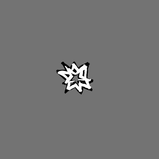
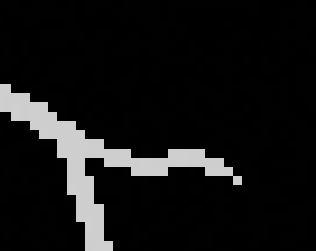
"Starry"
The first one I did was the starry one; as it explodes, shooting stars come out, not the two that explode into single, perceptively-unified stars. I went straight ahead, starting with frame one, and drawing the animation moving forward. So, the first frame is just a big, unsteady star, each spike pointing in a direction I expect the smaller stars to disperse in. The second frame, the smaller stars are nearly in the place they should end in, instantly. All successive frames are just them moving slightly away from the center and shrinking before vanishing. I also started drawing only white, then manually outlined every frame with my brush's blending mode set to "Behind." (If you never use any other brush or layer blending modes, you can almost treat one layer as two layers by using the behind brush blend mode.)
After about an hour or more, I was finished, and asked a few artists what they thought, and what it looked like to them. The main thing I got from them was that it's "magical," like a wizard beam landing. I didn't have any immediate ideas as to how to do it better, so I just tried something else.
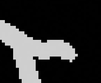
"Cut"
In our fighting game, we have a character that fights with a pair of scissors. I thought maybe I could make an effect specific to that. Again, I took the straight-ahead approach to animating it, with only a notion in my head to guide me. This worked mostly nicely, but the effect wasn't violent and fast enough, resembling a stroke rather than a cut. The fix to this was actually pretty easy; I removed the second frame entirely, so the jump between frame 1 and 2 was more significant, and the general motion was more of what I wanted. However, as I was drawing this, I also thought about the cloth and skin that would separate, and tried to abstract that in jagged waves dispersing from the main element.
"Brute"
After making the cut, I wanted to try again with a generic blunt effect. Same method as the "Starry" effect, except with differently-shaped outward elements and more of them. At the end it seemed I overcompensated. But, I thought there was also something unique, because it felt to communicate this absolute pulverization, so I decided to keep it on the shelf.
"Generic"
I literally just tried again, but to get a more reasonable amount of disperso, and I also chose to make it smaller in case we used "Brute" too, so there was more distinction. I think I accomplished this sufficiently, though a criticism I got was that it's too radially symmetrical, and I don't really know what to say about that till it's in.
"Ashesmack"
<There should be something here, but there isn't>
Posted by Gagangrene - February 11th, 2020
I opened up Unreal for the first time for real today. I've been in the editor before to see how models look in it, but haven't used it for anything more focused. I started with the particle editor because that's what a group in my class needed, particles.
In the top right of all the windows, there's a little tutorial button, and I watched through each tutorial on the main editor, particle editor, and in incidence the material editor. The particle tutorial pulled up this premade fire particle, so in my usual fashion, I stopped looking at tutorials and just attempted to dissect the creation to figure out how to use it. I came up with this:
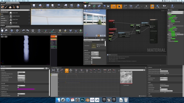
It's not useful yet. But, in dissecting the fire's material, I found that the fire used am 8x8 sprite sheet and the T_soft_smoke you can see poking out together, I can use info from the Particle editor in the shader graph, and found out that some of my knowledge from using the AE tool particle world has transferable skills.
Posted by Gagangrene - February 10th, 2020
I made a brick texture again:
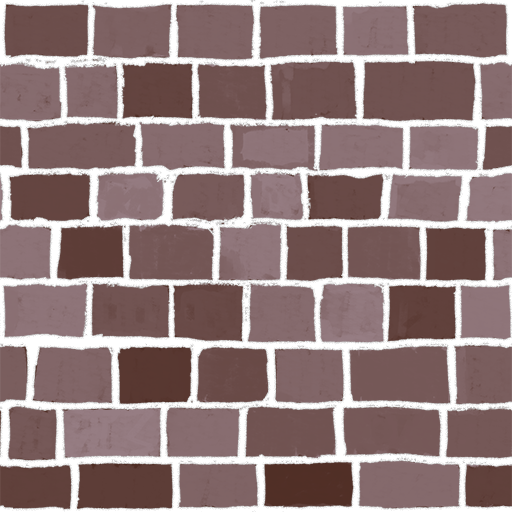
I started with a dark, moderately saturated brown base color in a 2048x2048 canvas. I extended the canvas, so I could draw out of the borders. I used Photoshop's guides to keep the horizontal lines mostly consistent. I drew the mortar in a single tone of white, then took the lines crossing the borders and moved them 2048 pixels inward on top of the lines inside the borders, so that my lines wouldn't appear to be cut off when the texture tiled. Then I copy/pasted the pattern to the left and right of itself to see how it would tile there.
To get the multiple brick colors, I made a Hue/Saturation layer, turned up the Lightness, back the hue, and then drew over the mask the Mask. I had my foreground color as white, my background color as black, set my brush's foreground/background color jitter to 100%, and turned off "per tip" so that the jitter was applied per stroke, and then colored in each brick with one stroke each. To get it to loop, I'd only draw over complete brick "cells," use the rectangle marqueee tool, select that part of the mask, and drag it over from one side of the canvas to the next.
I also took the white lines again, and on the same layer, copy/pasted it around in a 3x3 grid around the original, and applied an inner glow layer filter to simulate ambient occlusion. We're doing a 2D game so getting Unity to do that isn't viable.
Anyways this texture sucks, it's both too detailed for the game it was made for, and it also just doesn't look that good. The bricks were never meant to look even or well made at all, but there's some bits that were made poorly in that you can clearly see where I stopped the brush, and the layer filter is highlighting holes in the drawn-on mortar pretty well.
This is pretty much how I do all of my looping textures right now, but I realized over the weekended that I can use Blender to get perfect and more convenient looping through it's 3D texture painting mode and some scaling of a plane's UVs. Gonna have to try that out.
Posted by Gagangrene - February 5th, 2020
Between 5pm of January 31st and 11am of February 2nd, I participated in the Warren Tech Creative Jam.
Not the global game jam, but intentionally coinciding with it. I still made a game with my friends at WT. <There would be a link here, but it doesn't exist. yet.>
Our team consisted of 4 artists, myself included, 3 designers, and 2 programmers.
We had a fraction of the graphics design room to share as a workspace, the room with an inconsistent swath of computers, but also plenty of them, with Wacom Bamboo tablets, and the limited real estate of single screens. Unfortunately, the room was also pretty far "inland" in the landmass that was the building, so there were no windows and it was always hot during the day. How the graphic design class functions in there every day is a mystery. We were "prepared" to manage our game with a git repository, since that would work with the school computers as well as laptops we brought from home. It looked like we were well constructed for success till 5pm.
The theme was "Wolves," announced at 5pm.
I specifically wanted to make a twin stick shooter, even without the shooting part. (We're in a school, we literally can't have any resemblance of guns.) We did make a twin stick shooter. You play as the wolf of Pompeii, who historically died chained to it's house, and kill sulphorpus and ashen reanimated corpses as you try and escape the burning city. The chain to your collar is the melee weapon you control, or that's what it would've been if we got it in properly in time. Ri[.
So: Day 1, the end of January 31st.
CHEWY HIT THE HYPERDRIVE
Day 1 was a trip. Not in any drug related sense, just that we broke a bone as we tried to hit the ground running. The bone was the git repository. It was going so good... for a whole 90 minutes... We decided to do pixel art because one of our designers offered to help with art too, saying he can do pixel art. His art wasn't bad, but his animations were out of step, unsurprisingly. I started with making a 3D wolf model that I would later composite and pretender into sprites, but after the night was over I never touched it, and it was never finished. We did get a wolf sprite though. I went to bed first, and as I closed my eyes, I witnessed the shambling git repository.
Day 2, the optimal day to get things done.
I wake up at Breakfast time, and we just humor each other for 30 minutes as we eat. At the end, I ask the programmer who's up, "how's the repository." To my surprise, he and the rest of the team hate it, despite having worked with an svn before. Something went wrong down the line that we weren't prepared to fix, and we didn't want to spend any more of the remaining 28 hours we had working on it We used one or two flash drives for the remainder of the jam. I spent an extra few minutes to sit around with our late team member while he ate breakfast, because I didn't want him to be lonely, and then found myself working on managing the art assets. I was the only one who knew how to even vaguely set up sprite sheets, animations, animators, and such in Unity, so I spent a lot of the time putting all those together, manually. Not doing art, but managing what was there, and coming in. I was fine with this though, everyone was hard at work. After noon though, someone took out their Nintendo Switch. And this is where jade was begot in my veins.
My team went into Party Mode, dancing to Venga Bus and Caramelldansen, wasting time and only entirely returning to earth and work 20 hours later to clean up. Of course there was always at least one of us working, but I wish they'd try and push themselves to work a bit for this special occasion, and because we're on a clock.
Late in the day, some time between and after dinner, I opened up Photoshop to give our wolf a proper walk animation. Because of the perspective and the resolution of the sprite, as well as my inexperience working from a top-down perspective, I think the animation isn't worth bragging about. But I do think I made it look enough like a walk, or a canter as it's called, to the average eye.
Also around this time, I began emphasizing to start building the game, so we could address the biggest issues at the start of the next morning. But, I didn't quite realize when I had communicated my point to them, and so I briefly repeated and continued, till they expressed their annoyance. I sat down and continued to work on the wolf walking animation, also hit build to see what would happen, saw nothing remarkable because I didn't understand Unity scenes in builds and was the first to sleep again.
day3, welcom to die .
I wake up about 6 hours before the deadline. The room is completely silent, the lights are dim, and the only computers that are on shouldn't be. On the floor, everyone is sleeping, scattered across the floor like the gibs of several exploded tables in Gmod, and posed like the like's ragdolls. I sat down and took the time to continue making the wolf canter animation, specifically making the tail move convincingly. I started by animating a little skeletal guide of parallel lines, swaying back and forth and with the most distal segments lagging three frames behind. Then I painted over half those frames with one color to make a silhouette of the tail, and just flipped the silhouette for the other half. Then I locked the transparency and painted a second tone over every frame. This starkly contrasts with how I animated the legs, which was mostly abuse of selecting and moving. Ultimately, the tail looks the best.
Posted by Gagangrene - January 27th, 2020
I've been doing a lot of 3D lately.
For one, I've been busy with this model, a premade asset for a game jam.
128 tris exactly. Made with the intention of being placed down hundreds of times, and viewed from above, because the team wanted to make a top-down game no matter what.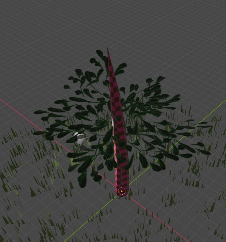
All the textures are hastily made while I wait for some better ones. This one's also better than other trees I made because all of the leaves are rotated to face upward in a focused direction, unlike the other trees I've made with nearly random leaf-plane rotations.
I also made this for a different team, same Game Jam.
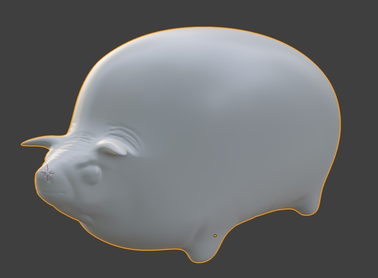
I call it the Oathog, after those 19th century livestock paintings and that "May I have some oats, brother" meme.
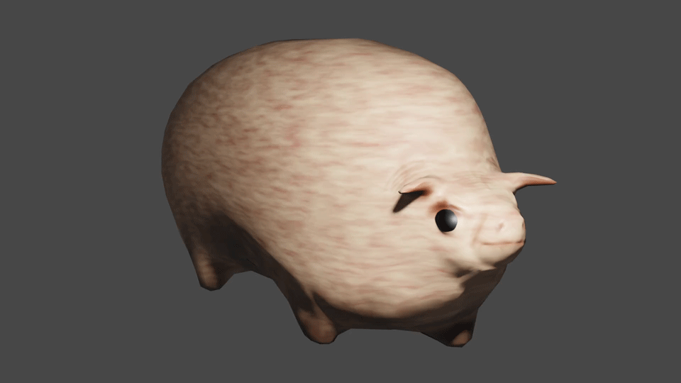
This thing took a lot more work to put together than the tree of course, which I will go into more detail in another blog post. However, I do want to summarize: I stared with a very, very simple minecraftish-geometry shape.
I then used the subdivision surface modifier to make its shape more circular.
Still only barely resembles the pig. I then extruded some legs out of this orb-y mass, again making legs that just look like cubes. Also, I cut out a few of the edge loops around the head to make its head more proportionally complex and head-shaped, as well as giving it some basic ears that were really just bent and squished pyramids. Then I used Subdivision Surface a second time to smoothen out the geometry again, getting almost to where the model at the beginning is. I decimated the said model angularly, and later added one more set of edges for animation, and that's the end of the story for the topology of this model. Except I diverged during this last step, making a second copy with the subdivision surface cuts cranked up way past a reasonable count. I used Blender's sculpting tools to etch out eyes, nostrils, a mouth, and a few fat folds around the body, and then with this high poly mesh I baked a normal map onto the low poly.
High poly:
Low poly with normal map:
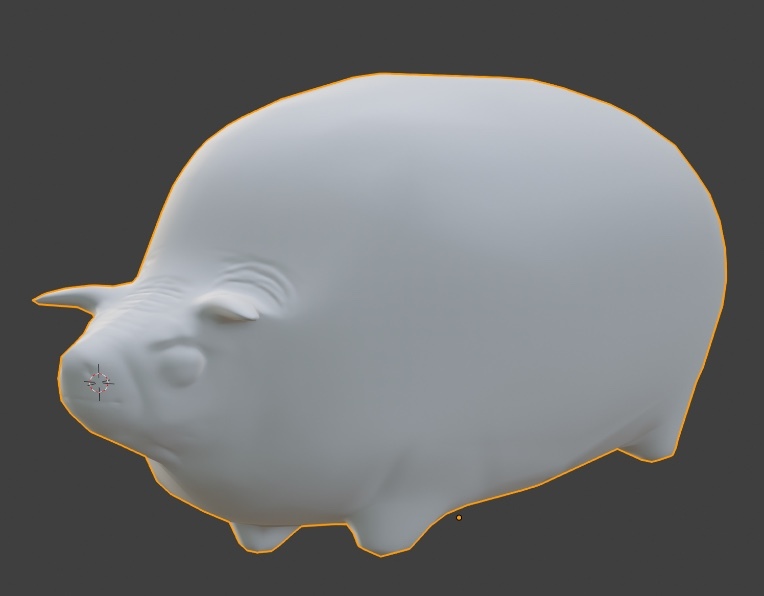
:D
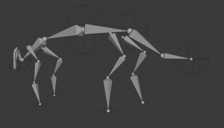
Giving it an armature was interesting. I wanted the legs to barely waddle as if it's fat was locking up its legs like honey, but at the same time it's very characteristic of animals like this to have well defined shoulders. I ended up giving it more shoulder than foreleg.
But wait, there's more!!
:DDD
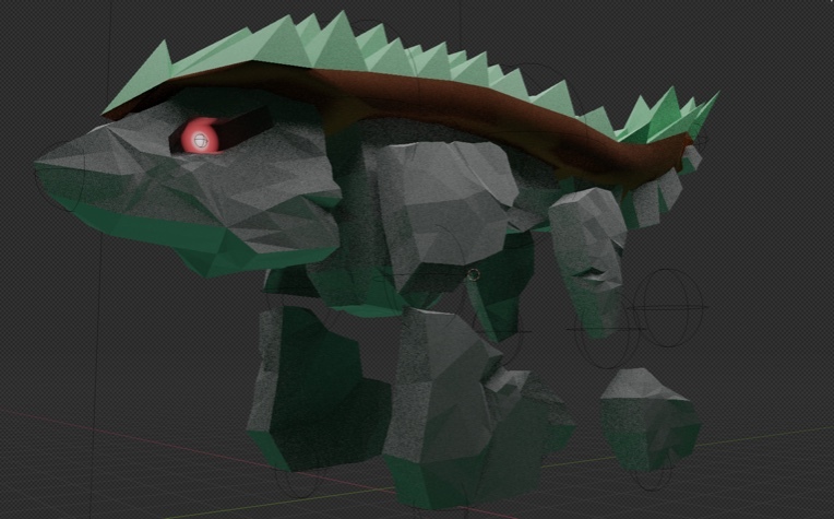
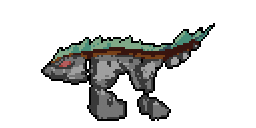
rock wolf
There's a lot going on in this model too. Firstly, the red-dot-eye is just a texture, entirely controlled with a shader graph that uses an empty's object space as a UV map. It's also made symmetrical, one eye mirroring the other, by adding it's coordinates to itself, but it's X value multiplied by negative 1. This incidentally also means that the eye is more cylindrical in reality being a sphere mapped with no, and abut it's not a problem to me because you can only see the eye from one side at a time...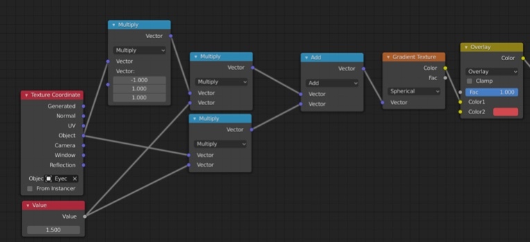
no wait, this is stupid and way more complicated than it needs to be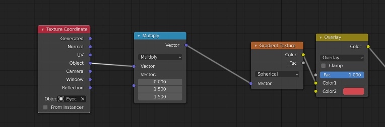
That's better
Okay what else...
Let's go with "simulating imperfection," another thing this model does. This model is for Filly Astray, which is pixel art. 3D used in 2D isn't very deceiving, being how perfect it is. However, Guilty Gear is pretty well known as an exception to this rule, fooling people at least long enough to where their minds are blown in realization. I'm not that familiar with the game, but if I remember correctly they've got their models only interpolating at 12 frames per second, even when the rest of the game is running smooth. Their models have pretty intense polycounts as far as I know, so they can not only get smooth outlines, but simulate imperfection as they outline each vertex. I tried to do a similar thing with this wolf model, subdividing it for extra vertices, then applying noise as a displacement texture, and making that texture worldspace mapped. As a result, the vertices are just slightly offset toward or away from their normal, randomly, seeded with the world their in, so the silhouettes and contours of the model are always look slightly different as it moves, like an animator's humanity in their strokes. However, this also makes the shading appear more noisy, and when it's getting downscaled like it is, I think it's effects are either unnoticeable or backwards. Oops, that's dumb.
Oh, and compositing.
I've learned better ways to composite than DJTHED has taught me last, or at least for this purpose. 
THIS NODE. REMEMBER THIS NODE. Previously, I would thicken no-AA outlines and silhouettes with the blur filter, then use the color ramp to turn all those grays into full white. This, however, takes a much more direct and predictable path, and is also just simpler. I haven't tried it, but you might also be able to get it to work with Anti-Aliasing on, so woo hoo on that :D
But wait oh wait wait, there's yet more :D
[THIS IS HIGHLY IRREGULAR]
So for yet another game at Warren Tech, my school, there's this guy for a 2D fighting game. We made our game in Unity's 3D space, even if we're going to use orthographic view, it's still 3D. Currently, we're using 2D sprites in After Effects, but wow does that make the art folders massive; Over 1000 sprites. I wanna gut that all out, unfortunately to our poor animator, and instead use a 3D model made to look 2D. The advantages: We can have even smoother animations because the keyframes are stored as positional data and the interpolation is internal, we can make the model break out of the second dimension for animations. I don't have many other comments about this guy, other than putting him together was interesting. Each body part is a separate mesh, just a plane, skewed slightly so it doesn't clip, and manually UV'd. Thankfully Duck, the artist who drew the texture for this rig, is okay that each body part is just slightly disproportionate and offset. This'll be more interesting when it moves.
Posted by Gagangrene - December 16th, 2019
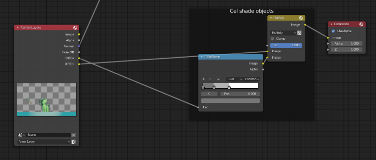
So we left off with this. This is how we make the shadows stop and start abruptly, like cel shading. Tweak the positioning of these stops to your liking. If you connect this image output directly into the composite, it should look something like this.
Now, let's hook this up with the multiply node. It doesn't matter if it's plugged into the top or bottom in this case, since multiply is just math, and multiply is commutative. White is 1, black is 0, shades of grey are fractions. Feed Diffuse Color into the other image input of Multiply, and

Our render result should look something like this, now.
Now we can end just about here. Take these two diverging nodes, combine their results together with another blending node, plug it's output into the compositor, and be done.
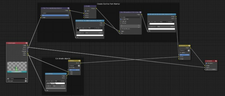

Posted by Gagangrene - December 16th, 2019
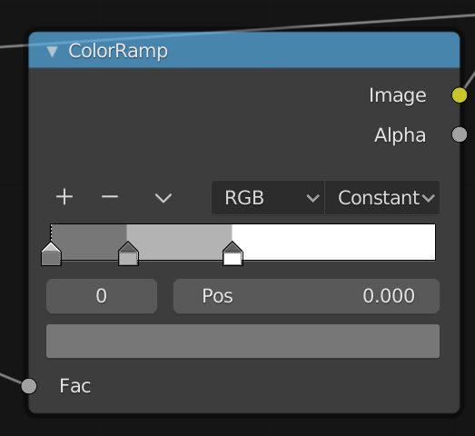
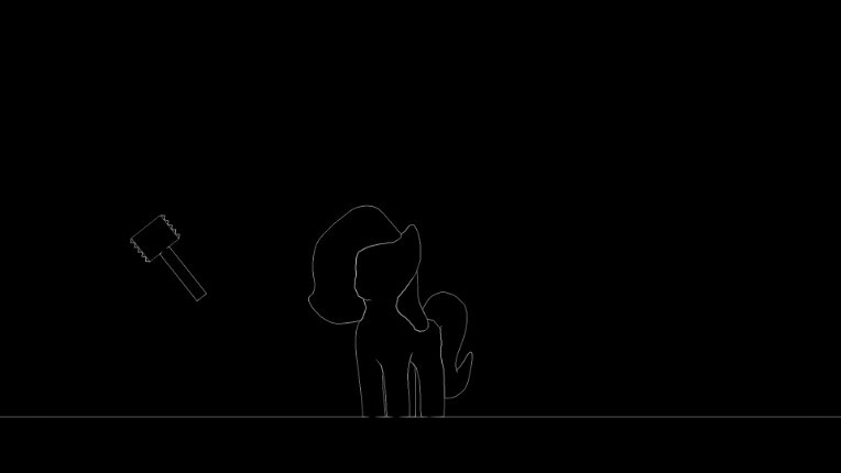
So by default, our color-ramp should've made our final composite look pure black. Like I was saying, move the white color stop to the left, and watch as outlines appear.
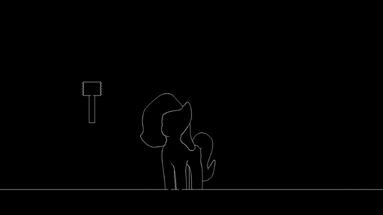
And it's important you don't bring it too far to the left, or you'll start getting outlines in places you might not want them in. (Also don't worry, I accidentally moved the hammer and accidentally hit render again, that's not anything to do with the compositor.)
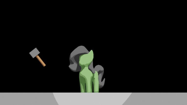
Now we have an outline, albeit it's got no anti-aliasing, and looks very pixel-y. One solution to this is instead of using the "Constant" interpolation mode and moving the white stop to the left, we set it back to linear, move the white stop back to the right, and instead move the black color stop from the left to the right.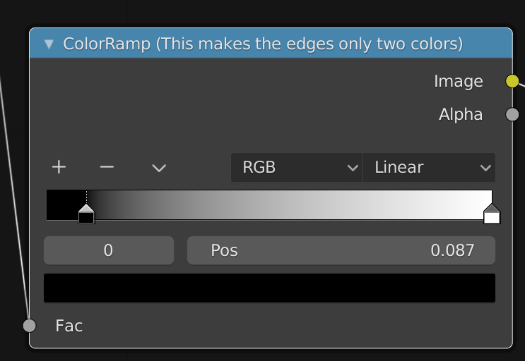
Now the effect is a lot cleaner, with smoother, somewhat-anti-aliased lines.
However, this does have a few issues. The Color Ramp is replacing any outline or color or pixels under it's value with pure black, so our "Anti-aliasing" stops prematurely and the outlines are still kinda pixel-y. Just less. That's why I don't recommend this method. And also with that said, I will not be using this method for the rest of the blog.
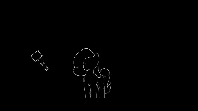
So the next step is also optional, but I've grown to like it. Our outline is pretty thin, and that can't be changed in the Laplace node or the color ramp node to any significant degree, and it'll look even more miniscule if we render in 4k. So, we're going to blur it to make it bigger, and use a color ramp node again to turn all the shades of grey into full-bright white.
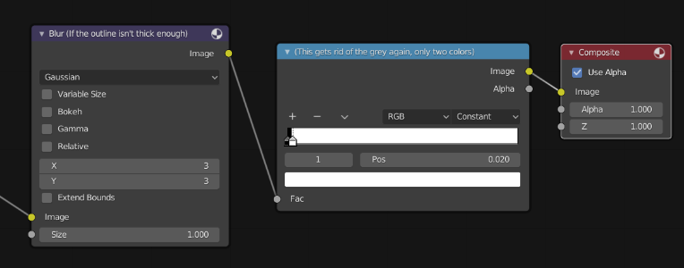
You can reconfigure the X and Y values to your liking in the Blur section, which will scale up the outlines. I imagine you can surmise what the color ramp does, so I will not explain it again. In the end, we should have a nice, thick outline.
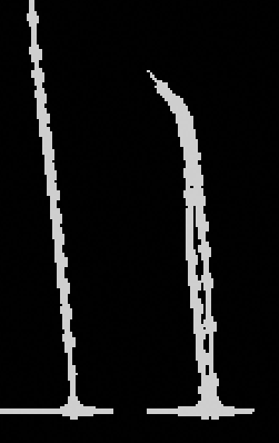
But, perhaps you're not satisfied with the thickness of the line, still. It's all got the same weight, and the sharp ends of lines are now very circular and uninteresting.
Before: After:
But luckily, there's a solution to this issue too.
Turn on "Variable Size" in Blur. This means that different parts of the image can be blurred by different amounts.
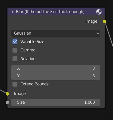
Next, feed the output of the Laplace node back into "size" input of the blur node.
The outlines will appear thin again, naturally. Turn up the X and Y values for scaling to your liking, I'm choosing 10 to make it clear. Look at that, Variable line quality! Sharp, pointy ends!

Oh wait.
OOoooh noooo.
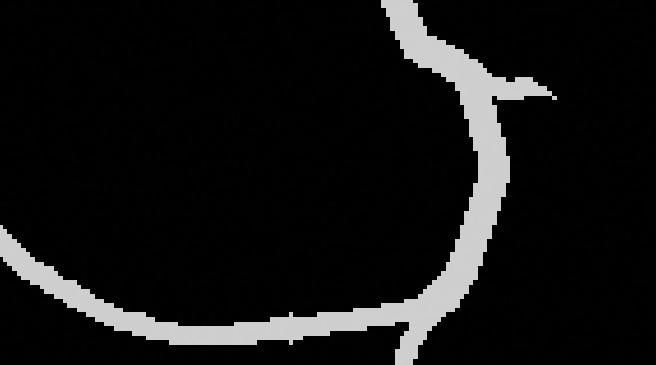
What is that!?
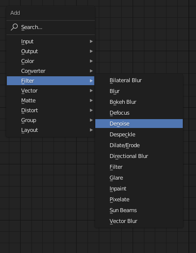
This "Beading" is the result of anti-aliasing, when the approximation of a line has to jump from one row or edge to the next, and the line abruptly gets thicker. I don't like it. Perhaps you don't either. Let's do our best to clear it out. The way I propose the solution is a very simple one. A denoise filter.
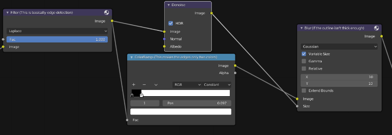
Something about this, while so barely noticeable if we were to compare the Laplace node and the denoise output, it's very effective. It doesn't outright remove the problem. bit in the end it's pretty well swept under-the-rug.
Now for me, I think that's enough fooling around with outlines. Time for Shading.
Shove all these nodes out and away, so we have room for some next set of nodes.
Let's start with this:
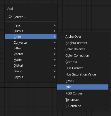
To get the "Multiply" node, grab the Color>Mix node, and set it to "Multiply" instead of "Mix" once it's down. Mix nodes function like photoshop blending modes.
Feed Diffuse Direct, the light "reflected" into the camera, into the Color Ramp. node. Add color stops either by clicking between the existing stops, or by hitting the "plus" icon. Change the color of the selected stop by clicking on the bar just above the "fac" input. I'm using greys right now, but actual colors will change looks.

Oops, again at the 20 image limit. Guess this is now a 3-part tutorial!
Posted by Gagangrene - December 14th, 2019
Firstly, I'd like to attribute a lot of what I'm talking about to the teachings of this video.
I'm assuming you've already got some Blender experience, know how to change shading in the 3D viewport, have a model and scene configured, and you just want to shade it uniquely. You need at least Blender 2.81 for this.
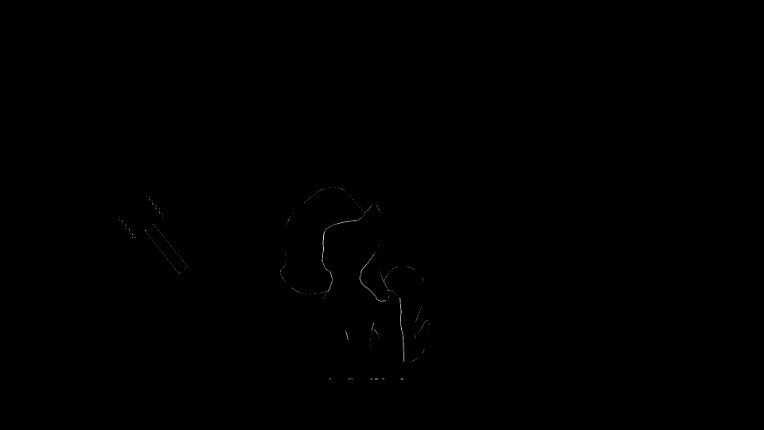
So I can turn this: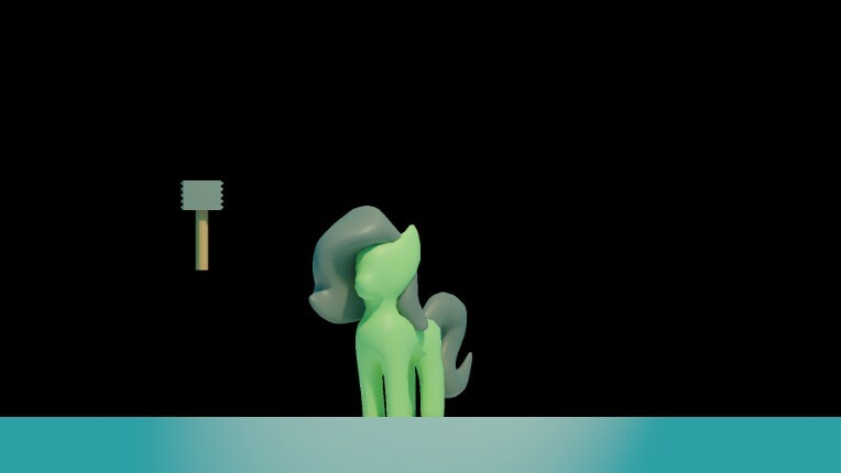
Into this:

With the compositor:
And I'm going to teach you how to do it too, assuming you have a model of your own.
Before you use the compositor, there's a few properties about your project you need to change so you have all the tools to make this.
First and foremost, you need to be using the Cycles render engine, and in the compositor editor, we need the compositor to use nodes.
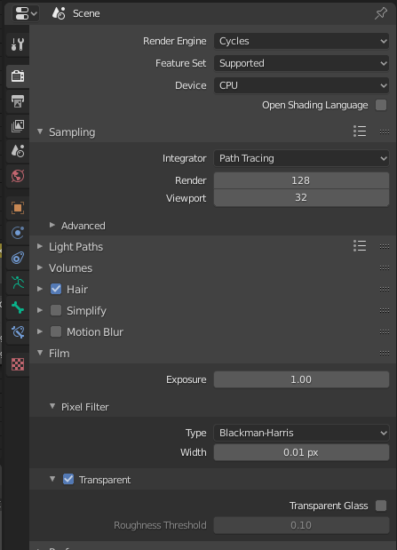
Cycles gives us the most options in the Compositor, of which we will be needing 4, and of which I am using 5.
Also, note that in Render Properties, under the film section, Pixel Filter Subsection, I have the width set to 0.01. This effectively removes Anti-aliasing, the blur on diagonal lines that makes them appear smoother (This is optional, but I have it off because we're using constant color ramps set to constant, and that also won't anti-alias, so I want this whole image to be more cohesive in it's look). "Transparent" is also naturally unchecked, but if checked it will turn the background transparent for our raw render as well as give us an alpha channel to work with in our Render layers node. Speaking of which, let's just look at that for a second:
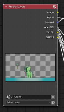
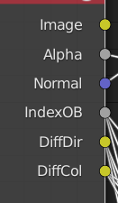
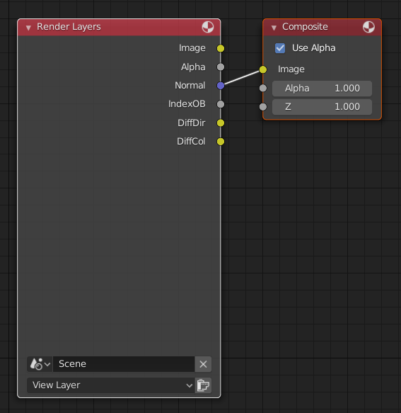
These are our render layers. "Image" is the complete render, Alpha and all the Diffuse layers put together. Alpha is set as described before, and the rest of these options are set here, in Layer Properties:
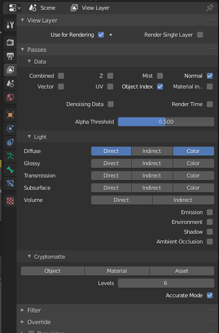
In Data under the Passes section, we want "Normal" and "Object Index" checked. Normal give us a normal map generated from the render which we will use to create our outline. Object Index, shortened to IndexOB, is a unique channel that can be filtered out to create a black and white silhouette of specific meshes, which we will use to mask shadows and thus change each shadows' colors individually.
In the "light" subsection, we also want Diffuse Direct and Diffuse Color enabled, shortened to DiffDir and DiffCol in the Compositor. Direct is a layer describing just the light a model receives, which we can use to Cel shade. Color is a layer just describing the colors from Materials, no light affecting them.
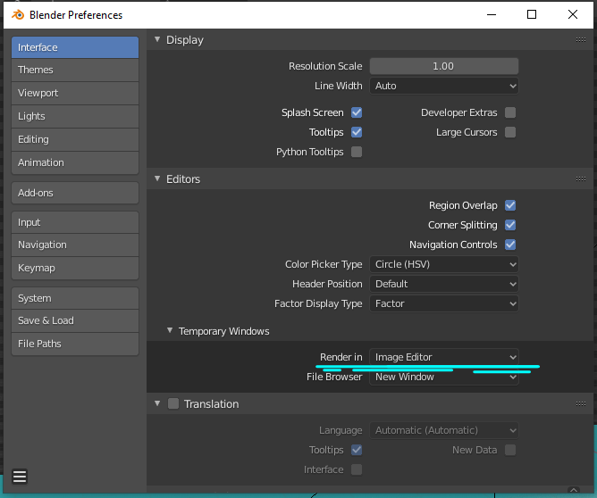
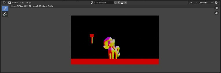
Now you might be reading through and noticing there's not much changing in the 3D viewport right now. That's perfectly intended. We're also not seeing changes anywhere else, and if you've been following this guide, that's also intended. But to clarify where all this is going, press F12, or look at the top left corner, find "Render," and hit "Render image." You will need to do this every time you open the project, and it typically takes some time to complete when using the Cycles render. This will usually open up a new window to show the render, but you can Find "Edit" and hit "Preferences" to reconfigure this to show the render in an area in Blender.
Now for the fun part, where we actually use the compositor. This comes after that rendering process we just did with F12, so you won't need to re-render the whole scene as you edit the compositor graph.
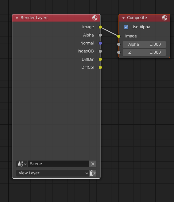
The Nodegraph should by default look something like the image above. The Render Result in the image editor will display whatever connections are in the Composite node. Knowing this, you can take a different "layer" output from Render Layers, feed it into "Image" of the Composite node by clicking on one of the dots and dragging i, and look to your Render Result to see how the render looks. (To make a connection, click on a colored dot to the right of the node, and drag it to a dot on the left of another node Connections flow from right sides to left sides.)
IndexOB won't do anything, right now, but the rest will, and I recommend you experiment and see what they do. Actually, I recommend you feed the output of any your nodes in the process whenever something unexpected or wrong happens. It's great for troubleshooting.
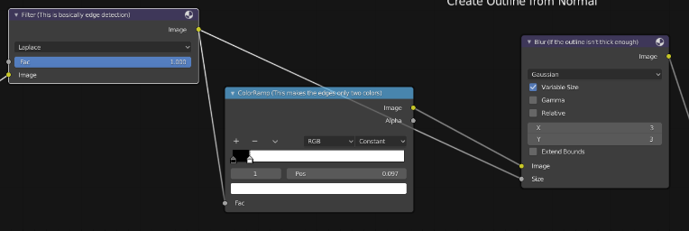
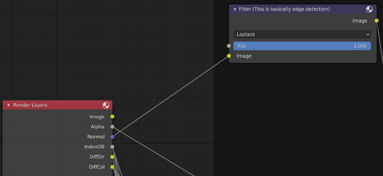
Now, for realizes, we're going to dissect a nodegraph and also explain how to make it. This part of the nodegraph is one way to make the outline, based off of the normal. This method, or at least the way I made it, will not Anti-Alias, but stay tuned if you DO want anti-aliasing.
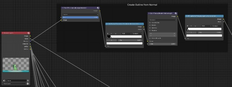
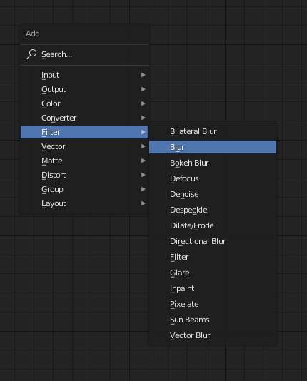
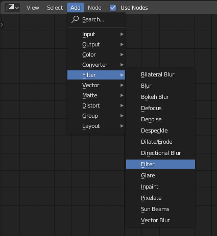
To create a node, go to "Add" in the top left corner. Alternatively, with your cursor over the compositor area, press Shift+A.
We're going to want a Filter Node, first. Set it to Laplace, and connect The Normal output to the Image Input.
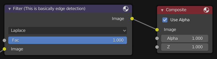
And, maybe we should also take the output image from the Filter Node, and connect it to the Compositor Image Input, and look at what it does to the render result.
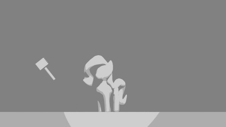
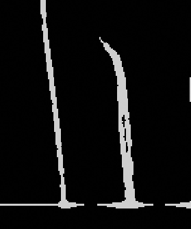
The Render Result should look something like this: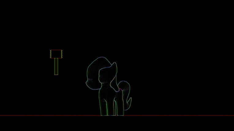
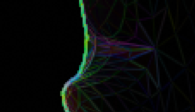
Maybe it looks useful to you, but you and I both know that this alone isn't going to be useful. It's Edge-detecting EVERYTHING. Every edge is traced to some degree.
And that's what the next node is for, to gut out all those unwanted edges. And there's two methods to get rid of it.
We need the Color Ramp Node for both methods.
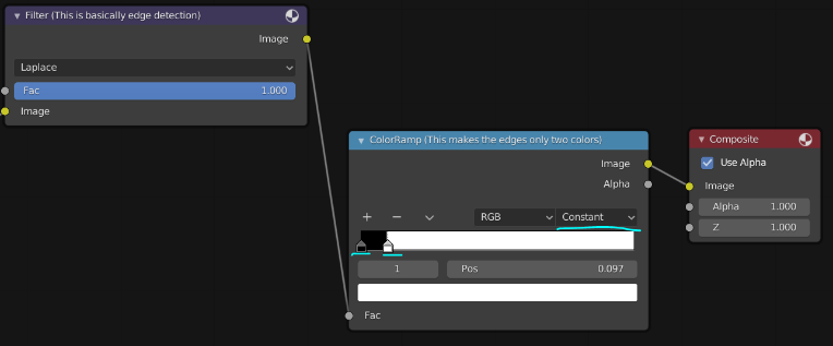
Where the methods diverge is how we use the node. For this first method, we're not going to be doing any anti-aliasing and removing the colors from the Laplace output. Change the interpolation method from "Linear" to "Constant,"
and hold-click the little white box at the rightmost edge of the value scale, and drag it towards the left. As you drag it to the left, edges should start appearing as white.
(Uh oh, Newgrounds won't allow a 21st image on this post so time for another blog post.)