it's my birthday :)
im the potion seller of art and my potions are too strong for you.
https://bsky.app/profile/gagangrene.newgrounds.com
Age 23
None
Colorado
Joined on 10/5/15
- Level:
- 7
- Exp Points:
- 477 / 550
- Exp Rank:
- > 100,000
- Vote Power:
- 4.92 votes
- Art Scouts
- 1
- Rank:
- Civilian
- Global Rank:
- > 100,000
- Blams:
- 0
- Saves:
- 10
- B/P Bonus:
- 0%
- Whistle:
- Normal
- Medals:
- 100
- Supporter:
- 5y 6m 24d
Gagangrene's News
Posted by Gagangrene - January 20th, 2025
whaaaaat??
I don't even know what that means but im honored :D
Posted by Gagangrene - January 7th, 2025
anthropomorphic big slushie boobs robot zebra woman
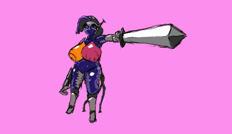

I can't ever draw my own characters consistently :(
Posted by Gagangrene - January 7th, 2025
gonna start uploading the good and presentable bits of art I've drawn to the portal, once a day or somethin. Probably nsfw stuff.
Gonna also try to compile sketch dumps in blog posts, since the site tells me every time not to post sketches to the portal.
Posted by Gagangrene - July 22nd, 2021
Workin on something.
Will it get done by Madness Day? Probably not.
Will it get done? Probably not, hopefully I'm wrong!

Posted by Gagangrene - June 18th, 2021
I wanna upload weird Adult content but I'm afraid that my teacher checks this still
Posted by Gagangrene - May 30th, 2020
Twitter is hell, I've been out of school playing too many games, let's get back to work.
Posted by Gagangrene - May 2nd, 2020
So what started as a doodle became a a 3-day project. I was enjoying the cyber-aesthetic of Madness, endless concrete walls, titanium doors, desaturated tables, and more computers than furniture. So, I started making just that. Everything but the character here is my doing.
Concrete:
I started with walls, floors and ceiling, and tried to make them look like concrete. But, how do you make concrete look like concrete at this resolution, and in this limited color pallet? Concrete's distinction usually come out of it's silhouette, not it's actual texture; the texture appears smooth if you don't focus your eyes on it, or are looking at a low resolution like this.
I did find myself studing the look of concrete while waiting for a bus one day, though. And I saw a few details that I think helped me out now. Concrete has a very subtle and fine grid-like pattern to it, looking kinda like fine knitting. Also, due to the debris that catches in it as well as just the aggregate inside it as it forms, there's usually some shiny spots embedded in it's surface. I tried to incorporate this into the sprites, even though the details are so much smaller than the resolution enables them to be.
Most of the shading is done in a weird back and forth of crosshatching, drawing with each step of shade as straight lines and overlapping them. Concrete also never appears pure white, so I was hesitant to represent those shiny spots with white. Instead I opted with a slightly pinkish looking color, #e9dbe2, which is the nearest-to-white color in the pallet that isn't actually white. I think it does it right. You might not even know it has color if you're not paying attention, it looks as bright as it could be, but isn't as obnoxious as white actually would be. Also, I made almost all of the tiles fit the 16x16 box perfectly, no beveling, which is the best I could do to give an inherently shapeless thing a "concrete silhouette."
I also did ask around on Discord what people interpreted the tiles as, despite being confident in how it already looked.
In my opinion, these elements together got me what I wanted, or something that's at least close enough to be completed with context. The concrete looks as rough as the real thing feels, and looks more geometric than our rock tiles, which is the main thing I heard people call it when asking around.
Background:
The rules are different for making the background. Strictly dark, below-half-value colors. Making the background look like concrete is a special challenge, because I don't have half the color pallet, and also was trying to make a tile that wouldn't get old if repeated 70 times over per room. I don't think I really accomplished this goal completely, and still need to revisit it. The approach I took towards the main tileset wouldn't work, but I tried it anyway, taking two different shades of dark grey and also just plain black, cross-hatching everything with the three colors. The tile ultimately got stale super fast, as should be expected when there's nothing else, but also didn't look like concrete. There's no records of how it looks now.
I tried with a similar approach a second time, but drawing larger lines, and also lining the lines up more. This got a slightly-less stale looking tile, but it also ended up looking more like metal. This time it was a little more agreeable, so I just left it for a bit, and just would let my mind sit on it while I worked on other things....
[Wow I don't finish a lot of these posts, don't I? I intend to finish this one tho, later.]
Posted by Gagangrene - April 17th, 2020
4/8/2020:
I started working on a game jam game about taking over a ghost town by putting down plants. On this day specifically, I made a lil Doll's eye plant:
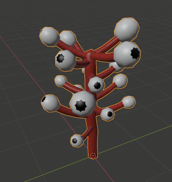
Something unique to this model is that all of it's textures were made procedurally, then baked.
To do this, I had to start out with something a little more like this:
2 materials: One for the stalk, which is just the factor of worldspace-mapped perlin noise going through a colorramp between a bright red and a dilluted greenish color. The other for the eye-fruit-whatever, with the mesh purposely kept at the center of the origin of the world to use a gradient sphere mapped from worldspace to create the "pupil."
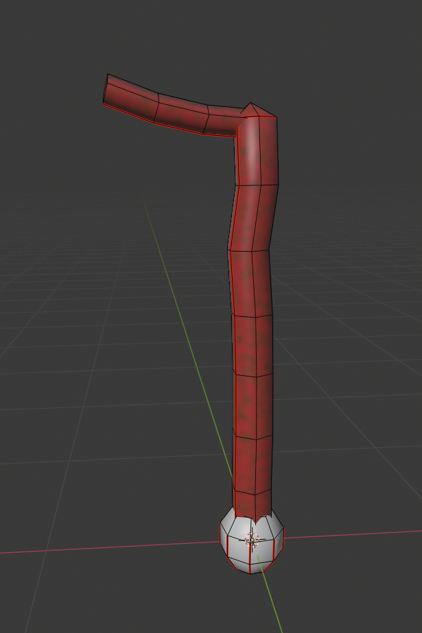
Once I had all my UVs in order, I put a new image texture in each of the materials' shader graphs, set the render engine to Cycles, went down to the baking section of the rendering tab, and baked diffuse color to get the final texture map. Then I set that texture to the base color of a new material, and set the whole object to use the newest material instead of the two old ones.
With that done, I moved the eye-fruit in it's place on the stem, then copy/pasted the stem and fruit several times around the central stalk, getting the final result that you see at the start. No pens were lifted in this process! Maybe there should've been.
4/10/2020
The them of this last week was really a lacking in self-discipline. Anyways, I made this much of a weird barnacle ladder plant thing, inspired by the ugly things in HL2. I didn't get to properly texturing it.
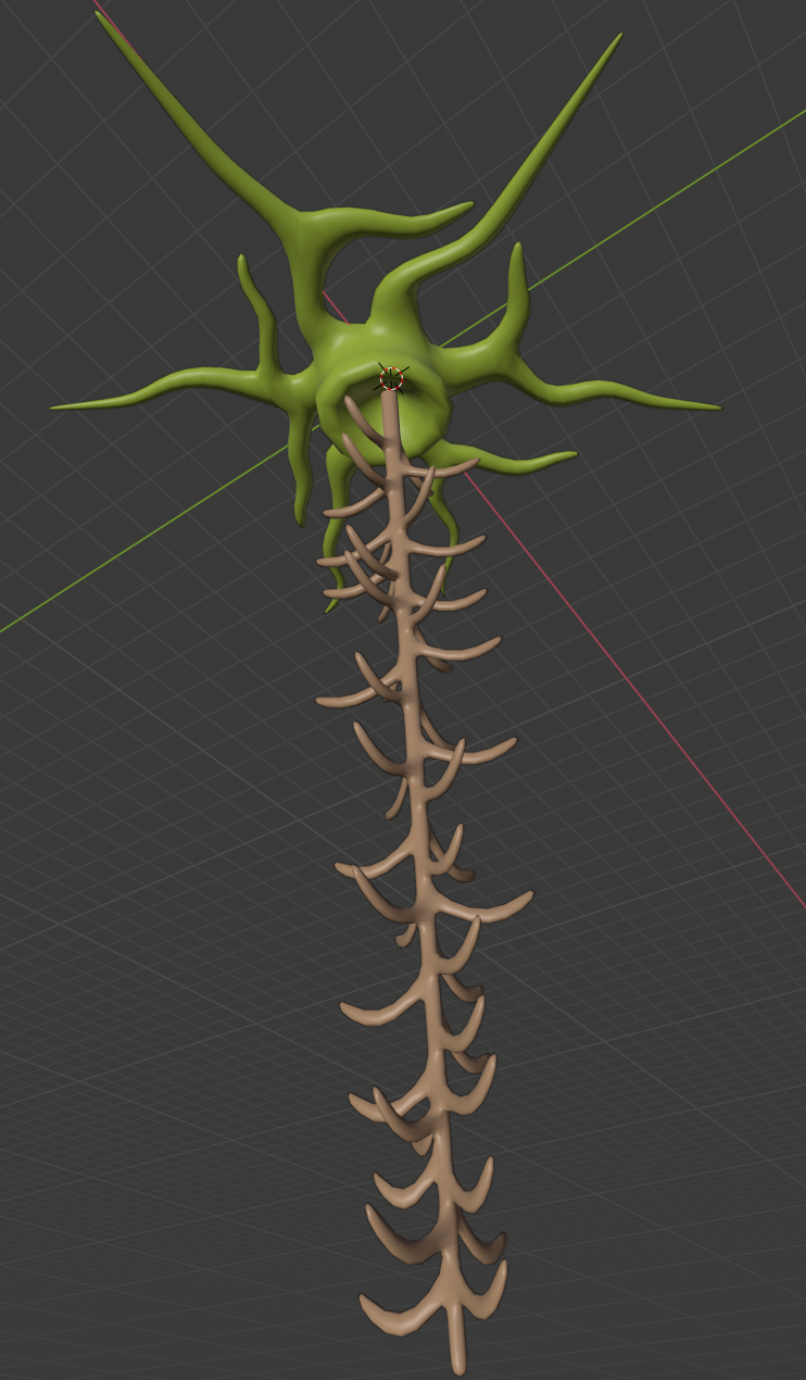
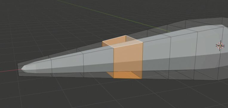
The process:
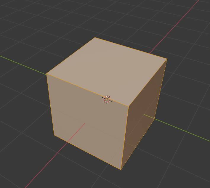
1: Make Cube
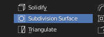
2: Subdivision surface modifier
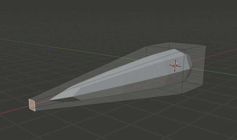
3: Extrude a face, then scale down
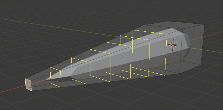
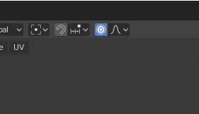
4: Loop cut (Ctrl+L or 12th option down on the left 3D viewport menu), scroll up while using for more cuts
5: Select one loop in the series, can be edges or faces.
6: Turn Proportional editing on
7: move selection to your liking, scroll up to increase proportional editing size, scroll down to decrease.
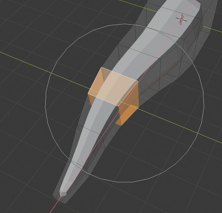
8: Rinse and repeat for wiggly roots.