So what started as a doodle became a a 3-day project. I was enjoying the cyber-aesthetic of Madness, endless concrete walls, titanium doors, desaturated tables, and more computers than furniture. So, I started making just that. Everything but the character here is my doing.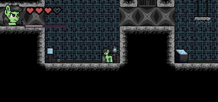
Concrete:
I started with walls, floors and ceiling, and tried to make them look like concrete. But, how do you make concrete look like concrete at this resolution, and in this limited color pallet? Concrete's distinction usually come out of it's silhouette, not it's actual texture; the texture appears smooth if you don't focus your eyes on it, or are looking at a low resolution like this.
I did find myself studing the look of concrete while waiting for a bus one day, though. And I saw a few details that I think helped me out now. Concrete has a very subtle and fine grid-like pattern to it, looking kinda like fine knitting. Also, due to the debris that catches in it as well as just the aggregate inside it as it forms, there's usually some shiny spots embedded in it's surface. I tried to incorporate this into the sprites, even though the details are so much smaller than the resolution enables them to be.
Most of the shading is done in a weird back and forth of crosshatching, drawing with each step of shade as straight lines and overlapping them. Concrete also never appears pure white, so I was hesitant to represent those shiny spots with white. Instead I opted with a slightly pinkish looking color, #e9dbe2, which is the nearest-to-white color in the pallet that isn't actually white. I think it does it right. You might not even know it has color if you're not paying attention, it looks as bright as it could be, but isn't as obnoxious as white actually would be. Also, I made almost all of the tiles fit the 16x16 box perfectly, no beveling, which is the best I could do to give an inherently shapeless thing a "concrete silhouette."
I also did ask around on Discord what people interpreted the tiles as, despite being confident in how it already looked.
In my opinion, these elements together got me what I wanted, or something that's at least close enough to be completed with context. The concrete looks as rough as the real thing feels, and looks more geometric than our rock tiles, which is the main thing I heard people call it when asking around.
Background:
The rules are different for making the background. Strictly dark, below-half-value colors. Making the background look like concrete is a special challenge, because I don't have half the color pallet, and also was trying to make a tile that wouldn't get old if repeated 70 times over per room. I don't think I really accomplished this goal completely, and still need to revisit it. The approach I took towards the main tileset wouldn't work, but I tried it anyway, taking two different shades of dark grey and also just plain black, cross-hatching everything with the three colors. The tile ultimately got stale super fast, as should be expected when there's nothing else, but also didn't look like concrete. There's no records of how it looks now.
I tried with a similar approach a second time, but drawing larger lines, and also lining the lines up more. This got a slightly-less stale looking tile, but it also ended up looking more like metal. This time it was a little more agreeable, so I just left it for a bit, and just would let my mind sit on it while I worked on other things....
[Wow I don't finish a lot of these posts, don't I? I intend to finish this one tho, later.]